

Flexbox Guide '0' to Hero.
Get Started With Flexbox☐ & Learn responsiveness.

Why Flexbox?
➤ In a perfect world of browser support, the reason you'd choose to use flexbox is that you want to lay a collection of items out in one direction or another. As you lay out your items you want to control the dimensions of the items in that one dimension or control the spacing between items.
➤ Flexbox makes it simple to align items vertically and horizontally using rows and columns. Items will "flex" to different sizes to fill the space. It makes responsive design easier. CSS flexbox is great to use for the general layout of your website or app.
➤ Flexbox is a purely css layout, which means the entire layout is managed and controlled at css level, no need to play with the markups. The flex model is capable to adjust its item's height/width to best fill in the available space of the container. The Flexible Box Layout Module makes it easier to design a flexible responsive layout structure without using float or positioning.
➤ You can use these flex properties to make your website more responsive. This includes using the flex-grow, flex-shrink, flex-wrap, flex-flow, and order flex properties. You can also learn about more flex properties to help you align the HTML elements on your website.
The main axis direction is defined by flex direction, and the default direction is left to right. The main axis of a flex container is the primary axis along which flex items are laid out. Beware, it is not necessarily horizontal.

The Large box is called the parent container - Flex Container.
By Applying the display: flex to the container, it reflects on the children's items. It makes all the items in the row direction.
.container {
  display: flex;
}
Flex direction
The flex-direction property specifies the direction of the flexible items. flex items as primarily laying out either in horizontal rows or vertical columns.
.container {
  flex-direction: row | row-reverse | column | column-reverse;
}

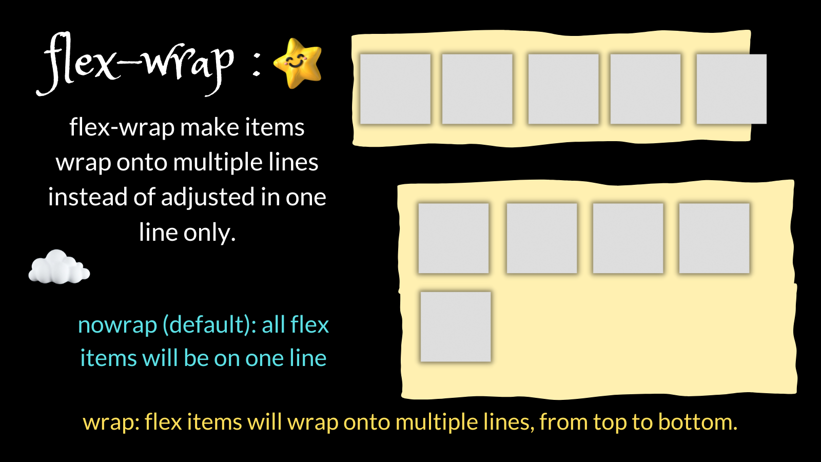
Flex wrap
The flex-wrap CSS property sets whether flex items are forced onto one line or can wrap onto multiple lines. The flex-wrap property specifies whether the flexible items should wrap or not.
.container {
  flex-wrap: nowrap | wrap | wrap-reverse;
}
The CSS flex-wrap property is used to specify whether flex items are forced into a single line or wrapped onto multiple lines. The flex-wrap property allows enabling the control direction in which lines are stacked. It is used to designate a single-line or multi-line format to flex items inside the flex container.
Justify-content
Justify content is used to align the items inside the container it can be at the start, end or between. Justify-content acts as the alignment along the main axis.The justify-content property controls where the flex items sit on the main
x-axis.
flex-start: This is the default value that aligns items at the start of the main axis.flex-end: This makes items sit at the end of the main axis.center: This makes the flex items sit at the center of the main axis.space-between: This distributes the remaining space between the flex items.space-around: This distributes the remaining space around the flex items.space-evenly: This distributes the remaining space equally to the flex items.
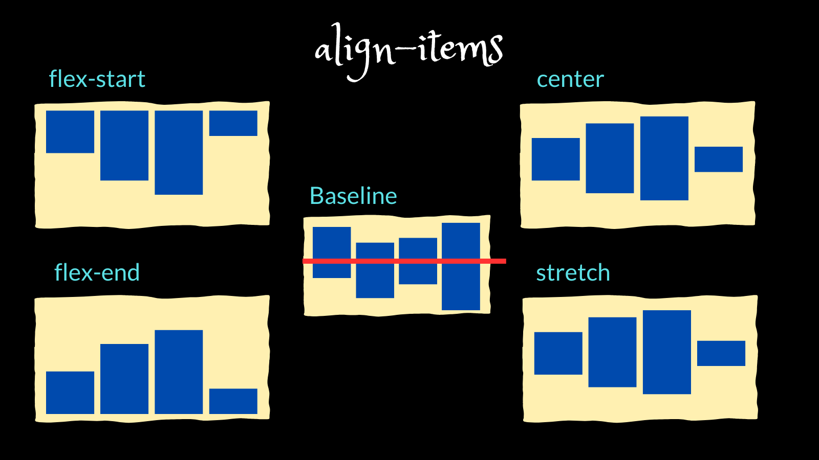
align-items
This defines the default behavior for how flex items are laid out along the cross-axis on the current line. Think of it as the justify-content version for the cross-axis (perpendicular to the main axis). The align-items property controls where the flex items sit on the cross (or y) axis.
stretch: This stretches flex items to fill the parent in the direction of the cross axis. This is a default value.baseline: This aligns the flex items at the baseline of the cross axis.center: This aligns the flex items at the center of the cross axis, and centers them vertically by default.flex-start: This aligns the flex items at the start of the cross axis, and aligns them vertically by default.flex-end: This aligns the flex items at the end of the cross axis.
align-content
The align-content property is a sub-property of the Flexible Box Layout module. It helps to align a flex container's lines within it when there is extra space in the cross-axis, similar to how justify-content aligns individual items within the main-axis. This property defines how each flex line is aligned within a flexbox and is only applicable if flex-wrap: wrap is applied.The align-content property specifies how flex lines are distributed along the cross axis in a flexbox container.
flex-start: items are placed to the start of the container.flex-end: items are placed to the end of the container.center: items are centered in the container.space-between: items are evenly distributed.space-around: items are evenly distributed with equal space around each line.space-evenly: items are evenly distributed with equal space around them.stretch: lines stretch to take up the remaining space.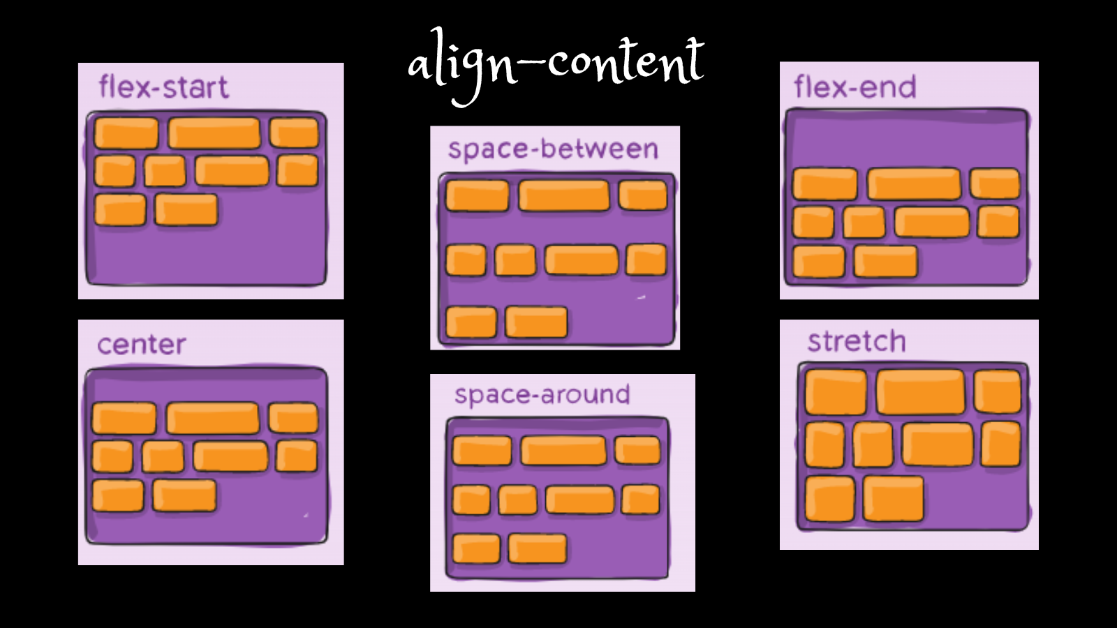
Conclusion
Flexbox is one of the important topics in css. The responsiveness of the website. flexbox plays a major role. Also helpful while making projects having a good knowledge of flexbox easy to make align & make pages function well.
comments are appreciated. Thank you🌼.


